On the cover

Once we had enough finished sequentials to do a preview book, it was time to work out a cover. If you've seen a copy of the B&W preview, you'll notice that the printing (ESPECIALLY the cover) is reproduced so inconsistantly that if it were turned in as a project for a High School printing class, it would rate a D- as best. Anyone who's seen a nice scan of the intended cover (here) can attest that it's head and shoulders better than the final result, which I can only assume was printed by half blind, homeless, crack addicted monkeys. It's a shame too, because I have the original watercolor painting of the cover at home and it's stunning...
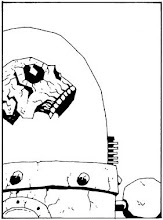
What most of you probably DON"T know, however, is that we had other cover concepts that were rejected. One of them (here) was based on a detail from the final cover painting. Another (here) was a similar idea, and contains an image that we eventually want to turn into a girls Enlightenment shirt. Still another was more radical (here) but also more crude. (the picture for today is another attempt at the same image that we had hoped to use as a poster at one time...)
Once we got the copies from the printer, however, it became obvious that we wanted very few people to see it because of the poor print quality. I weeded through the copies and picked out 20 of the best examples, such as they were, and we made them a signed & numbered edition which we gave out to a handful of industry people at the San Diego Comic Con. One of those people was Adam, the owner of Speakeasy comics.... But that story will have to wait until tomorrow.
posted by Tom Hall at 9/15/2006 12:11:00 AM
![]()
![]()


0 Comments:
Post a Comment
<< Home